SPARK Chart Overview
SPARKS
Axis SPARK
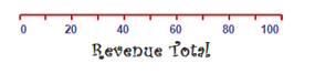
The Axis SPARK simply draws an axis line and is therefore a complement to other SPARKS. Use the Axis SPARK with the Bullet, Progress or Strip SPARK to add numerical information to their graphical representations.
BAR SPARK
The Bar SPARK draws a graphical column chart representing the values contained in the points field. The Bar SPARK is best used for displaying observations over a nominal scale (e.g., countries, testing conditions, etc.) or interval scale (e.g., time).
Bar SPARKS are the best choice for representing data with fewer data points.
Bullet SPARK
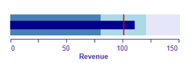
The Bullet SPARK is designed to display a single key measure of performance compared to one or more related measures (for example, a target) with varying colour intensities in the background to indicate qualitative ranges, (for example, good, average, poor).
A bullet graph solves the problems commonly associated with gauges: user comprehension and use of space. Bullet graphs are easier for people to understand than gauges, and utilise space more efficiently because they can be easily stacked or arranged side-by-side.
Grid SPARK
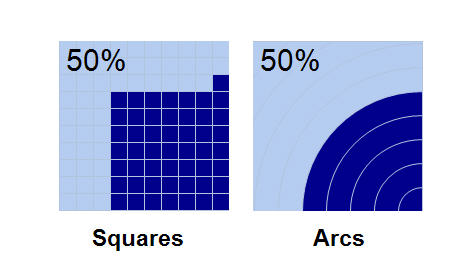
The Grid SPARK is a graphic representation of a single key measure as a percentage. This chart is useful for bringing attention to a particular member or value.
KPI SPARK


The Key Performance Indicator (KPI) SPARK represents your data with friendly images that are ideal for data dashboards, where visual statistics can be monitored and understood at a glance.
The KPI SPARK Properties window offers a selection of images representing “good, average and poor”, such as: traffic lights, arrows, circles and smiley faces. In addition, there are options that allow you to use custom KPI images.
Line SPARK
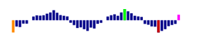
The Line SPARK is useful for illustrating trends and functional relations across a large number of data points. For example, Line SPARKS can be used for plotting changes in data over time, such as monthly temperature changes or daily changes in stock market prices. When the individual data points are connected by lines, they clearly show data fluctuations, which is information that can be used to predict future results.
Additionally, Line SPARKS allow you to add high, low, open and close markers to clearly emphasise significant points in the data series.
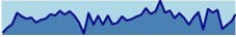
LineZone SPARK
The LineZone SPARK is useful for illustrating trends and functional relations across a large number of data points. The LineZone SPARK has the same functionality as the Line SPARK, with the additional option of adding a range which can be used to illustrate norms, for example.
The light blue bar (to the left) is showing a “normal” range:
Pie SPARK
The Pie SPARK conveys approximate proportional relationships, or relative amounts, at a point in time.
Pie charts can be “exploded” by pulling segments out of the pie for emphasis, where a small proportion of parts can be featured.
It is best not to use Pie charts for exact comparisons of values (because estimating angles is difficult for people) or for rank data; use column/bar charts for rank data and use multiple column/bar charts for grouped data. In addition, showing pie charts at an angle can distort the slices of the pie making it difficult to accurately compare slice sizes.
For representing data the most accurately, pie charts are best used when comparing fewer than four variables, and shown without angles or 3D.
Progress SPARK
The Progress SPARK is a great choice for comparing data sets. For example, Progress SPARKS can be stacked to illustrate sales figures against different regions, satisfaction ratings, or product reviews.
Strip SPARK
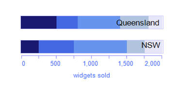
The Strip SPARK is useful for illustrating comparisons in data, where the goal is to compare values against a maximum value (100%). For example, the Strip SPARK (along with the Axis SPARK to the left) effectively shows the comparison of sales in Queensland and NSW:
The Strip SPARK’s compact size is suitable for dashboards and reports where there is little space for large bar charts.
Trend Arrow SPARK
The Trend Arrow SPARK is a single representation of upward and downward movement trends. The arrow automatically changes to the positive colour when the value entered is positive and to the negative colour when the value in the degrees field is negative.
You can customise the arrow styles, anchor styles, colours and line weights of Trend Arrow SPARKS.