Customizing your ViewChart
There are three sections in chart properties, Common, Default Series, Axes and Other Series. These three sections control specific behaviours of the Chart, the common properties, the default series properties and the Axes and Other Series properties.
Common Properties
The common properties section allows you to control the following:
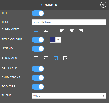
Title
Toggle whether you want to show a title on your chart.
Text
The text that you want to show as your title.
Alignment
The position and alignment for your title in two sets:
- Vertical
- Top
- Bottom
- Horizontal
- Left
- Middle
- Right
Title Colour
The colour of the title text.
Legend
Toggle whether or not to show a legend on the chart.
Alignment
The alignment of the legend with the following options:
- Top Centre
- Left Middle
- Bottom Centre
- Right Middle
Drillable
Toggle whether or not the users of the chart can drill down.
Animations
Toggle whether or not to show the chart animating from one state to another.
Tooltips
Toggle whether or not to show tooltips over the charts data points.
Theme
The preset colour theme for your chart.
Default Series Properties
These properties allow you to specify a chart type as well as specific series formatting for the default series. This is always the left most column in your data.
Chart Type
Select the type of chart you want to display from the following options:
- Column
- Bar
- Line
- Area
- Pie
- Doughnut
- Funnel
- Bubble
- Waterfall (Horizontal)
- Waterfall (Vertical)
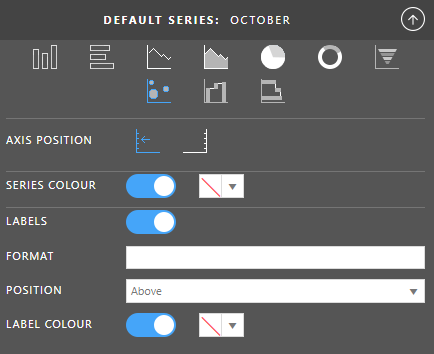
Axis Position
Which value axis will this series plot against, one of:
- Primary (left)
- Secondary (right)
Series Colour
The colour this series will show on your chart.
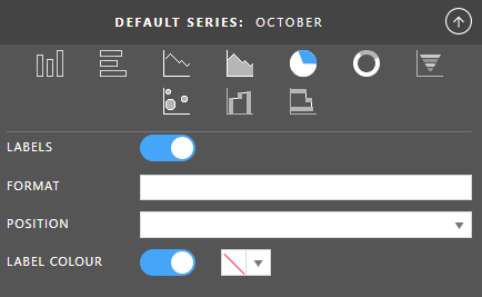
Labels
Toggle whether or not to show series labels.
Format
Set a number format on the labels. For more information on formating, see Date Formatting and Number Formatting.
Position
Set the position of the labels against the data point. This is different for the different chart types and could be one of:
- Above
- Below
- Bottom
- Center
- InsideBase
- InsideEnd
- Left
- OutsideEnd
- Right
- Top
Label Colour
The text colour of the labels.
Specific for Chart Type: Column, Bar
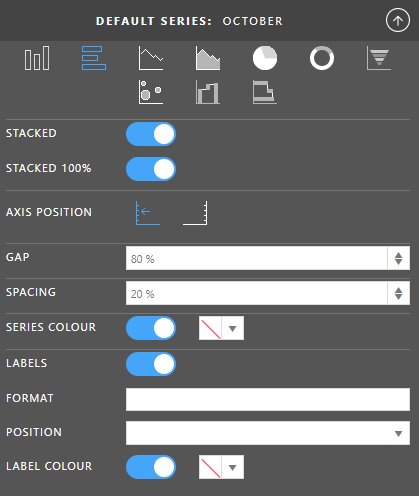
Stacked
Toggle whether you want to show you data as a stack.
Stacked 100%
Toggle whether to show the data points as a percentage against the total for the category.
Gap
Toggle whether you want to show a title on your chart.
Spacing
Allows you to set the distance between series points in a category expressed as a percentage of the bar width.
Specific for Chart Type: Line, Area
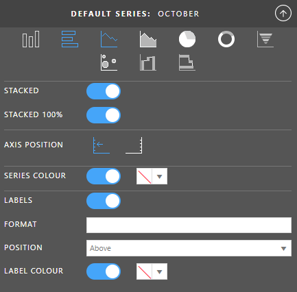
Stacked
Toggle whether you want to show you data as a stack.
Stacked 100%
Toggle whether to show the data points as a percentage against the total for the category.
Specific for Chart Type: Pie, Doughnut
Specific for Chart Type: Funnel
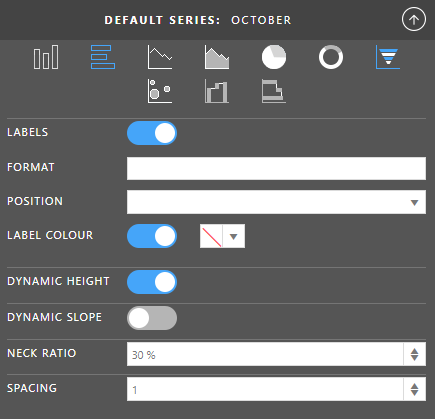
Dynamic Height
Toggle whether you want to show the funnel chart with a dynamic or static height. When dynamic, the size of each part of the funnel will be relative to the size of the data for that data point.
Dynamic Slope
Toggle whether you set to true the ratio of the bases of each segment is calculated based on the ratio of currentDataItem.value/nextDataItem.value The last element is always created like a rectangle since there is no following element.
Neck Rato
Specifies the ratio top-base/bottom-base of the whole chart. For example. a Neck Ratio set to three means the top base is three times smaller than the bottom base.
Only available when Dynamic Slope is disabled.
Spacing
Allows you to set the distance between series points in a category expressed as a percentage of the width.
Specific for Chart Type: Bubble
Specific for Chart Type: Waterfall
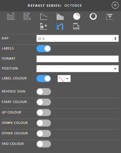
Gap
Allows you to set the distance between categories expressed as a percentage of the bar width.
Reverse Sign
Toggle whether you want to reverse the sign of the data being shown.
Start Colour
The colour of the first bar in the waterfall chart.
Up Colour
The colour of the bars that move upwards in the waterfall chart.
Down Colour
The colour of the bars that move downwards in the waterfall chart.
Other Colour
The colour of the bar that represents the other bar, which will show as the penultimate bar and will make up the difference between the first bar, plus the movements, minus the last bar.
End Colour
The colour of the last bar in the waterfall chart.
Axes and Other Series
This section has three parts, Other Series properties, Value Axis properties and Category Axis properties.
Value Axis
The Value Axis can have a Primary and Secondary set of properties configured depending on the chart type and whether or not you are plotting any of your series on the secondary axis. The properties are the same for both axes.
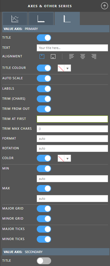
Title
Toggle whether you want to show a title on your chart.
Text
The text that you want to show as your title.
Alignment
The position and alignment for your title in two sets:
- Vertical
- Top
- Bottom
- Horizontal
- Left
- Middle
- Right
Title Colour
The colour of the title text.
Auto Scale
Toggle auto scaling of the axis data on / off. See this article to read more about Auto Scaling Charts
Labels
Toggle whether or not to show series labels.
Trim (Chars)
Enable the trimming of the label text. See this article to read more about Label Trimming
Trim From Out
Start the trimming from the outside (start) or inside (end).
Trim At First
Specify a character or set of characters at which the labels will be trimmed.
Trim Max Chars
Specify the maximum number of characters that you want in the label.
Format
Set a number format on the labels. For more information on formating, see Date Formatting and Number Formatting.
Position
Set the position of the labels against the data point. This is different for the different chart types and could be one of:
- Above
- Below
- Bottom
- Center
- InsideBase
- InsideEnd
- Left
- OutsideEnd
- Right
- Top
Rotation
The angle of rotation for the labels on this axis. This is set to auto by default which means the chart will choose the best option based on your lable length and number of labels shown.
Label Colour
The text colour of the labels.
Min
Toggle whether you are going to set a minimum for the chart.
The default is enabled and set to auto where the chart will automatically determine the minimum point based on your data. If the minimum value is above zero, it will be zero. If the minimum value is below zero, it will be lower than that point by a calculated amount.
The minimum can also be expressed as an exact number or a percentage (decimal between 0 and 1 or value with a percent sign) For example, if you are building a Waterfall chart and you want to make sure there is as much room as possible, you may set the minimum to something like 0.05 (5%) so that the distance from the lowest point to the chart category is 5% less than the smallest number.
Max
Toggle whether you are going to set a maximum for the chart.
The default is enabled and set to auto where the chart will automatically determine the maximum point based on your data. If the maximum value is above zero, it will be higher than that point by a calculated amount. If the maximum is below zero, it will be zero.
The maximum can also be expressed as an exact number or a percentage (decimal between 0 and 1 or value with a percent sign) For example, if you are building a Waterfall chart and you want to make sure there is as much room as possible, you may set the maximum to something like 0.05 (5%) so that the distance from the highest point to the top of the chart is 5% more than the largest number.
Major Grid
Toggle whether or not to show the major grid lines. These are the lines that are an extension of the major ticks through the body of the chart.
Minor Grid
Toggle whether or not to show the minor grid lines. These are the lines that are an extension of the minor ticks through the body of the chart.
Major Ticks
Toggle whether or not to show the major tick marks on the axis.
Minor Ticks
Toggle whether or not to show the minor tick marks on the axis.
Category Axis
The Category Axis is generally the horizontal axis.
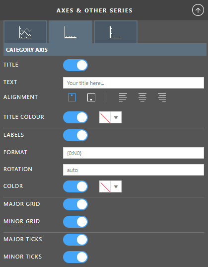
Title
Toggle whether you want to show a title on your chart.
Text
The text that you want to show as your title.
Alignment
The position and alignment for your title in two sets:
- Vertical
- Top
- Bottom
- Horizontal
- Left
- Middle
- Right
Title Colour
The colour of the title text.
Labels
Toggle whether or not to show series labels.
Format
Set a number format on the labels. For more information on formating, see Date Formatting and Number Formatting.
Position
Set the position of the labels against the data point. This is different for the different chart types and could be one of:
- Above
- Below
- Bottom
- Center
- InsideBase
- InsideEnd
- Left
- OutsideEnd
- Right
- Top
Label Colour
The text colour of the labels.
Major Grid
Toggle whether or not to show the major grid lines. These are the lines that are an extension of the major ticks through the body of the chart.
Minor Grid
Toggle whether or not to show the minor grid lines. These are the lines that are an extension of the minor ticks through the body of the chart.
Major Ticks
Toggle whether or not to show the major tick marks on the axis.
Minor Ticks
Toggle whether or not to show the minor tick marks on the axis.
Other Series
In this section, you will see a collapsed section for each series detected in your data (your columns). By default, they are toggled to inherit the properties from the default series as above, but you can disable this inheritance by using the toggle button on the right end of each series heading. The first image to the right shows the properties for November as not inherited and the properties December as inherited.
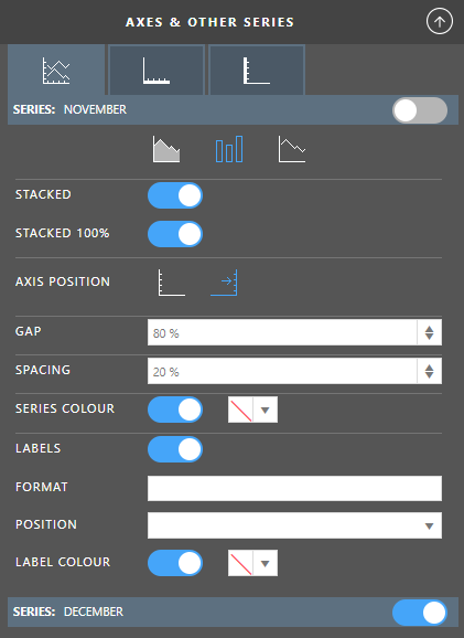
The properties you can set on the series are the same as the default series except for the chart types you can set as there are certain chart types that can not go together, for example a Bar and a Pie.