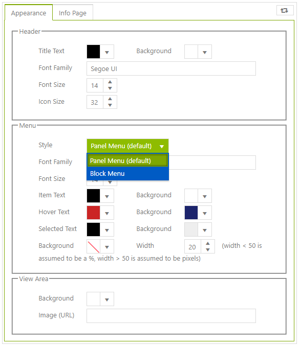
Customizing Appearance
Various fonts and colors can be customized in an App - as shown in the Appearance tab below. In addition, there are 2 menu styles to choose from: Panel and Block (from v12.2.1.14)
Menu Styles
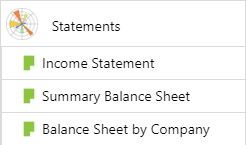
Panel Menu
The Panel menu style is the original and default menu style - using a tree-style navigation with image icons for each document
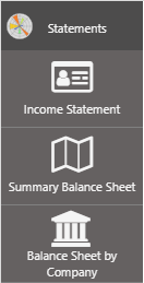
Block Menu
The Block menu style uses a larger “block-like” appearance for each item with a breadcrumb style of navigation and introduces the use of Font Awesome icons
Note
Font Awesome 5 icons are available from v12.2.1.218. Font Awesome 5 has more icons and is more customizable with regard to font weight and features such as duotones
To add a Font Awesome icon for a document, use the icon name, including the prefix, in the image field. The prefix will be either “fa” for Font Awaesome 4 or “fal/r/s/b or d” (see Font Awesome 5 Documentation) eg “fal fa-bed” or “fa fa-bed”.
Font Awesome icons can also be used in Panel menu style (since Block Menu was introduced) and image URLs can be used in either style. When using Font Awesome icons, they will not appear in the designer tree and so appear blank but will render when the App is opened.
When switching between Block and Panel menu styles, be sure to reset the default sizes and colors using the “reset” button (top-right).
Resetting is not automatic but many colors and sizes that look good for Panel style will not suit Block menu style - so it’s a quick way of making a menu look good to start.
Setting Menu Style in Designer